Bagel Point
Full brand identity for a UK bagel shop — logo, packaging, print and staff uniforms, built as one consistent system.
Bagel Point needed a mark and a system sturdy enough to carry across a full shopfront: bags, boxes, wax wrap, a printed menu, staff uniforms and everyday social posts.
Logo & brand mark
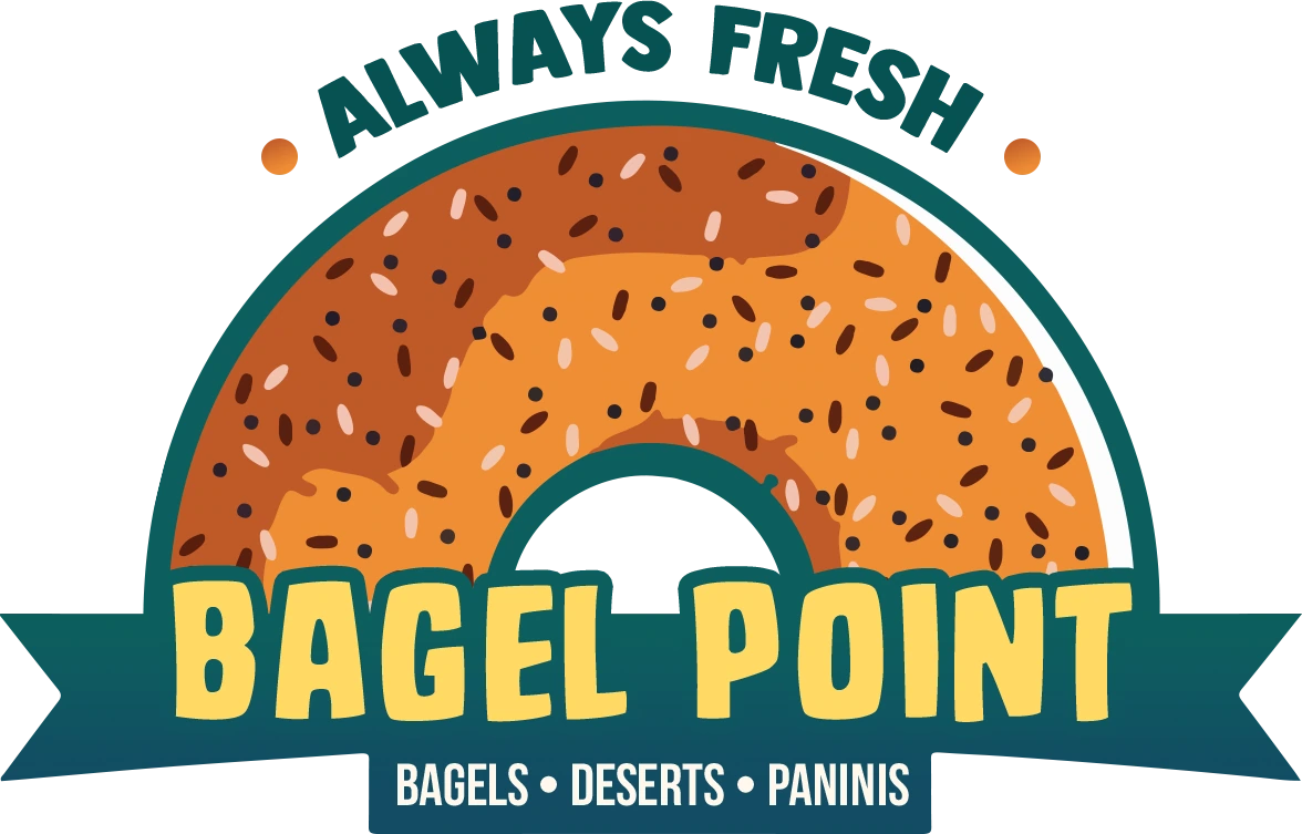
A sesame bagel arches over a hand-lettered wordmark and ribbon banner, with an “Always fresh” lock-up for tighter spaces like cups and sleeves.
Colour palette
#0C5E5E
#FFD965
#EF8E35
#FFEEDC
Deep teal anchors the mark, signage and menu headings. Mustard and toasted orange carry the bagel’s own colours across packaging and print. Craft cream stands in for paper and card stock throughout.
Packaging suite
The mark carries across a take-out bag, cake box, bagel box and coffee cup, printed in the same three brand colours on craft-cream stock.
Wax wrap & bagel sleeve
A tiled wrap pattern and a branded sleeve keep the mark visible from first bite to last.
Tri-fold menu
Bagels, paninis, wraps, hot drinks and cocktails, laid out on the same cream and teal palette as the packaging.
Storefront signage
The mark on a lightbox sign, built to read clearly from the street.
Team apparel
Staff t-shirts and aprons carry the logo as a single back print.
Social post & loyalty card
A ten-stamp loyalty card and story template extend the system into everyday social posts.
Bagel Point · Logo, packaging & brand system · 2024
Book me for a one-off, a full campaign, or a monthly retainer — and stop re-briefing a new designer every time.
mizansyl0607@gmail.com